The New Yorker
e-Magazine
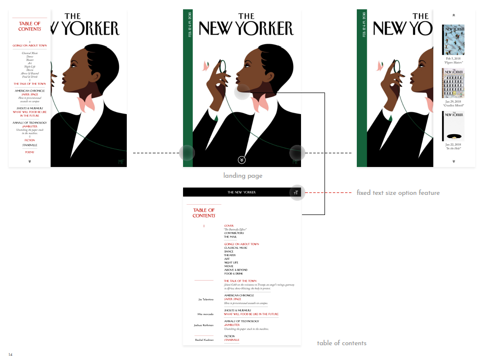
This project redesigns the user experience of the New Yorker e-magazine while maintaining editorial elements such as the grid system and typefaces.
The Design
LAYOUT
Maintain 3 column grid system, use hang line through out the publication to establish horizontal grid element.
TYPOGRAPHIC HIERARCHY
1. Titles are set in red display type (the New Yorker typeface), all caps, center aligned.
2. Subtitle is set in italic Adobe Caslon.
3. Typographic rule is used to different columns (red) and sections (gray) within each column.
USABILITY
Maintaining text size options and audible feature while simplifying UX by
1. Maximizing horizontal interaction that allows accessibility to all content with left & right panels.
2. Focusing on user readability by combining social media icons and all button into 'one-stop-shop' nav bar.