Simply Canon
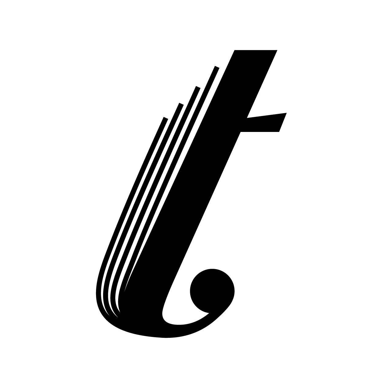
Simply Canon typeface is a typographic interpretation of a classic musical, Canon in D. This song is composed by Pachelbel with three violins and one cello, which becomes the most dynamic version of all Canon variations, embodying vertical depth of a quartet. The Simply Canon typeface not only captures the suspension of sound quality, but it also articulates the body movement of the artist while performing the piece. Letterforms are inspired by the lowercase ‘f’ in Bodoni typeface, which looks similar to a violin shape. (featured on Print Magazine's Typography & Lettering Awards 2016)